The challenge
Mental health is still a neglected theme for most Brazilians, in a country where 1 in every 2 inhabitants already thought about taking their own lives. In a scenario that was already chaotic and intensifies day after day because of a global pandemic, our team, composed of:
decided to accept the following challenge:
Strengthen Brazilians’ mental health using UX Design
Understanding the problem
According to WHO, Brazil is the most anxious country in the world and, to make matters worse, there was an 80% increase in cases during the pandemic alone and another 50% increase in cases of depression. This means a total of 20 million Brazilians with anxiety disorder and more than 12 million with depression. Furthermore, on average, 24% of the cases of anxiety will evolve into depression, which makes the situation even worse.
The scenario is worrisome, with no sign of getting better. In this chaos, the psychologists present themselves as the main agents for treating these cases, however, there are still barriers that prevent the situation from improving.
Project objective
Our objective is to understand the barriers that make it difficult for Brazilians to take care of their own mental health and perform the necessary treatments and, thus, to create a solution to overcome them.
Before scaling, the focus will be to ensure the best solution for the user’s problem with the least effort. Therefore, we will work with a reduced number of users, using two main goals (based on the H.E.A.R.T. framework):
- Satisfaction: achieve NPS greater than 75 (excellence zone) in the first 6 months;
- Retention: have at least 60% of active users (users who have recurring sessions) in the first 6 months.
After the initial stage of validation, we will direct our goals towards scaling the solution, in other words, we will mainly focus on increasing user numbers.
Creating empathy
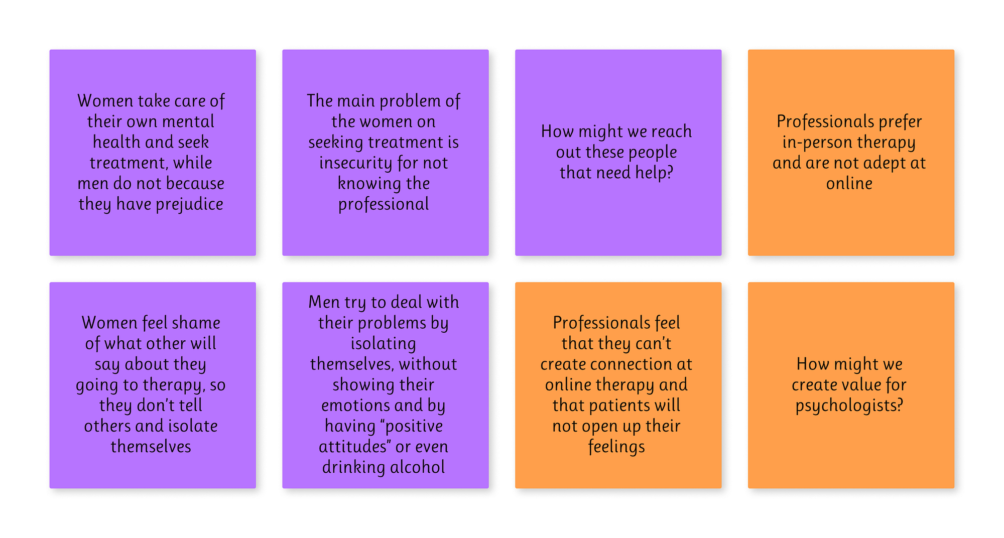
In order to have a deeper understanding of who these people are and what they are like, we built three proto-personas, based on our desk research. They functioned as a guide for us to conduct our research and were structured as a CSD matrix for each proto-persona, which helped us validate our suppositions and understand what the users’ pains really were. Our initial main suppositions and doubts were:
Quantitative research
We created two forms, one for patients and one for psychologists, basing the questions on the most relevant hypotheses and doubts of our CSD matrix. The questionnaire, focused on patients with almost 250 responses, helped us understand more about the users.
Check out the interactive dashboard made in Google Data Studio.
Patients
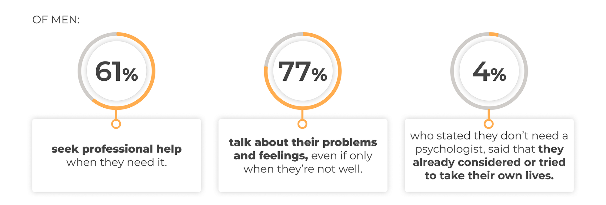
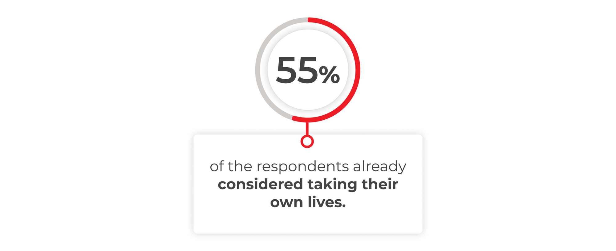
Contemporary men care more about their mental health than we thought. Despite that, among men who said they don’t go to a psychologist because they don’t need one (the stereotype in our proto-personas), only 4% said they had already considered or tried to take their own lives. This value is very contrasting with the totality of the research, in which more than 55% said that they had already thought about suicide. Our conclusion is that they don’t want, and believe they don’t need, the help of these professionals and, consequently, ours.
On the other hand, the research didn’t just help us in making sure that some of our suppositions were valid, but it also brought us new insights on how we could solve the challenge:
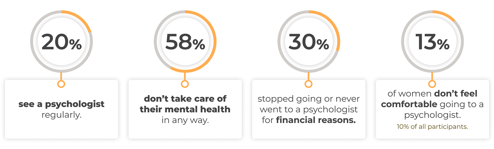
These data, especially the last two, brought many questions for us to investigate on a deeper level, as we know that…
… there is a discrepancy between what people say and what they really think, feel and how they act.
Psychologists
The quantitative research with the psychologists, despite not being as revealing as the qualitative part, gave us some directions of what we could explore:
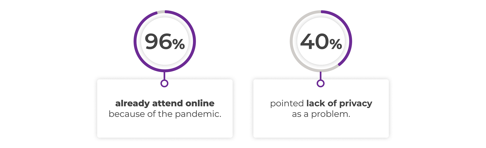
- Is “online” still a problem?
- Why and how do these problems with virtual spaces happen?
- How do these professionals acquire new clients?
Qualitative research
We did interviews to dig into the whys and into the feelings of our users, all of them related to points that were found in the quantitative research.
In order to write the interview scripts, we linked each one of the points that we would like to understand better to an open question with observations of what should be deepened, how and why.
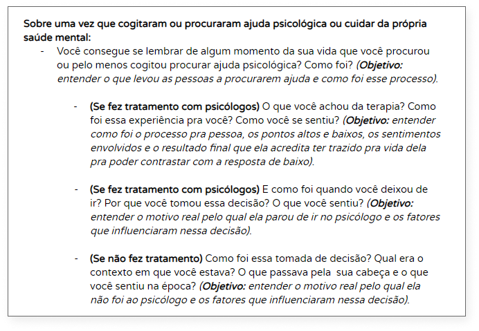
Check out the complete interview script.
After conducting more than 20 interviews, we could observe patterns that clarified key points for the project continuation:
Patients
- The “financial problem” was not that much “financial”. There are several popular initiatives and cheap alternatives for those who can’t pay. What happens is that in the majority of the cases people can’t find a psychologist that they like, feel comfortable and really trust in these places. Those “10%” in the quantitative research turned out to be much more significant than they seemed.
- People want fast results. When they finally find a good professional, most of them stop the treatment after feeling a little bit better. Consequently, symptoms come back, generating a vicious cycle.
- Online therapy is an alternative. Most people who have started doing online therapy felt more comfortable because they’re in a personal space behind their screens, so they feel safer to talk about their problems.
Psychologists
- They still strongly prefer in-person therapy rather than online. Actually, psychologists have a lot of ease with virtual spaces and they see many advantages in it, but they still think it’s important to have a physical place to attend in-person.
- Attracting clients for therapy is a problem. Psychologists acquire clients by word of mouth marketing and by providing therapy through health insurance. The first one is a slow process and the second one doesn’t give a good profit.
Personas and User Journeys Map
In order to align our new discoveries with the team, we redrew the 3 personas and their respective journeys:
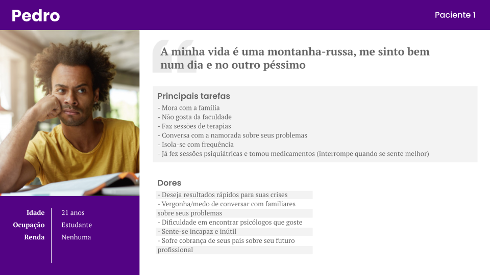
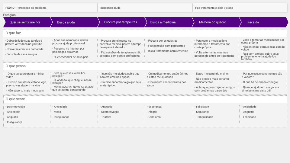
Check out the 3 complete personas and the user journeys map.
Ideation
With the validated personas and user journeys in our hands, we used the “How Might We?” framework to link our learnings with the idea generation. We rewrote each one of the main points in virtual post-its using the HMW and we prioritized them in an impact vs effort matrix using Miro.
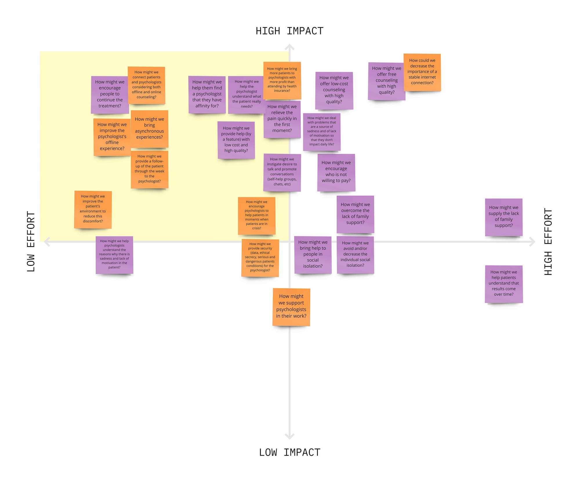
We identified through the matrix what was most relevant for the user and for the business and what would have the least effort.
We selected the main HMW and used it to generate solution ideas, taking only one main focus and important points to complement it, followed by secondary ones, which were, of course, still relevant for the whole experience.
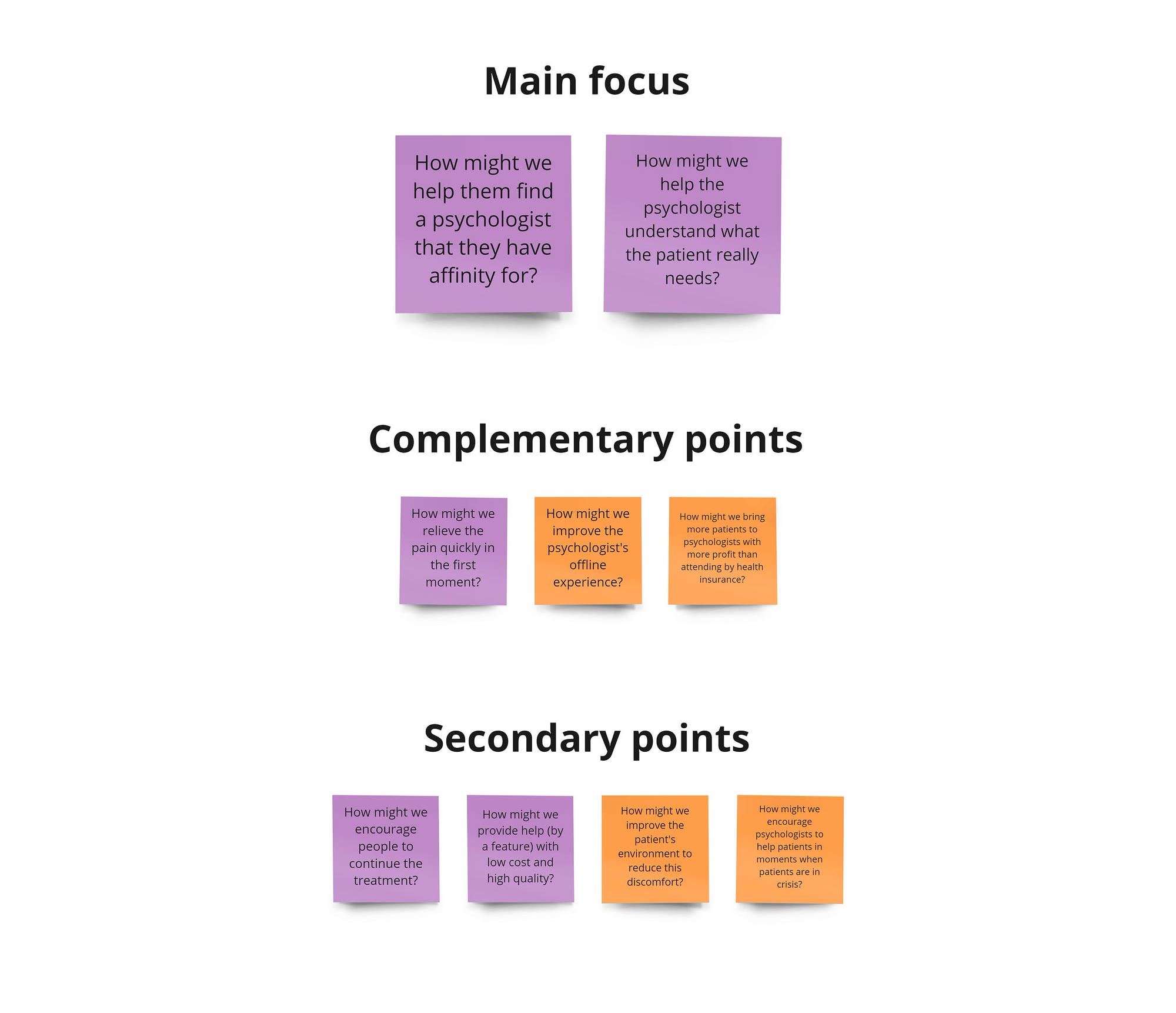
For each one of these points, we generated several ideas of solution — firstly individually and secondly as a group — , using 4 constraints: solutions that we could build with 1 billion dollars, without money, using magic and with futuristic technologies. Although some ideas generated with this framework seem impossible to implement, it’s very easy to make them tangible during the process and it’s where most of the innovative ideas come from.
Of all these ideas, we voted on the best ones and discussed each one of them, taking into account factors such as technical viability, available resources, relevance for the business and how these ideas could interact with each other. Then we started to deepen the solution.

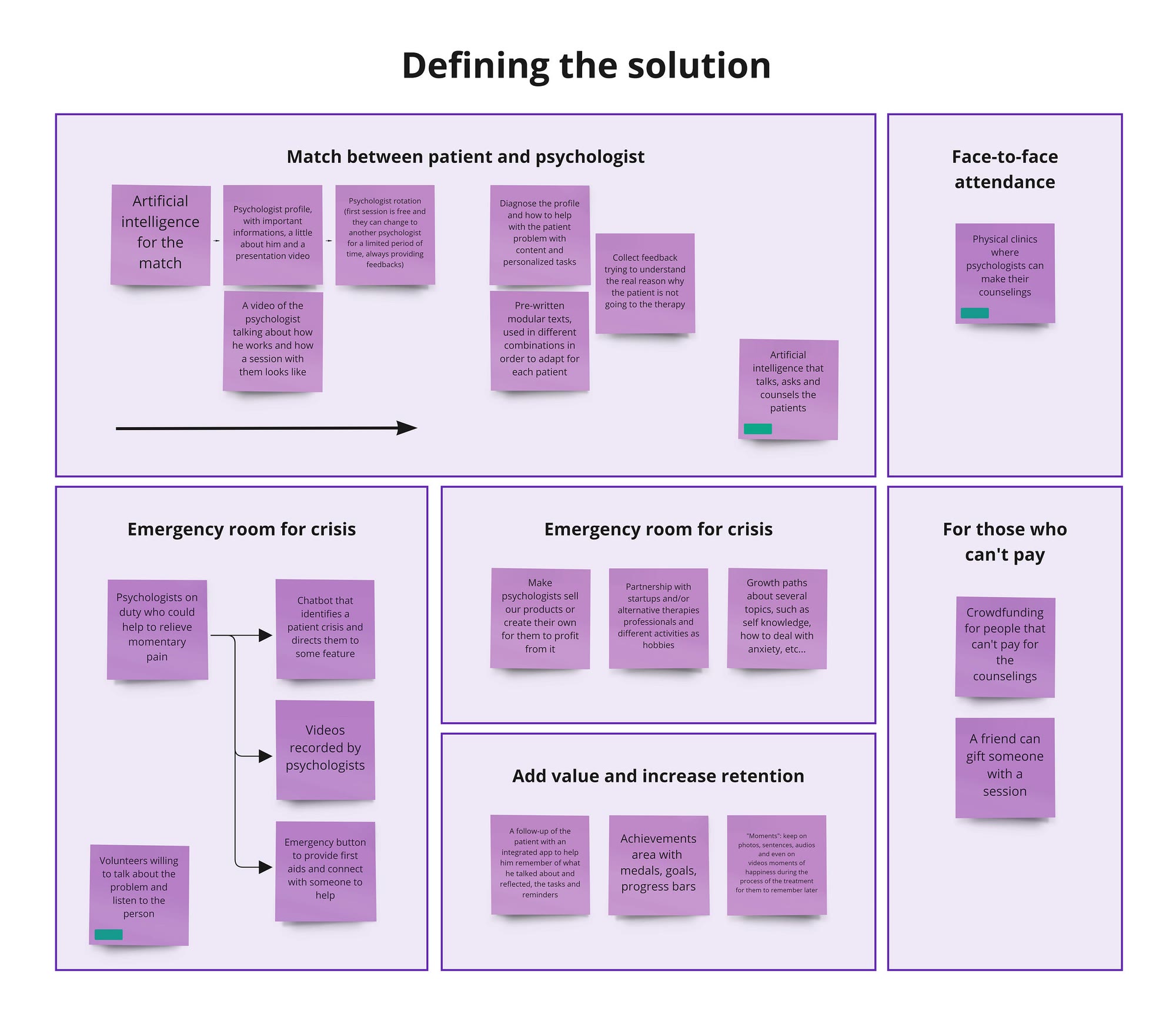
Check out the complete ideation process on Miro.
Benchmarking
We chose to just analyze our competitors after getting a better understanding of what the solution would be to not let the analysis induce it, keeping the innovation, but also trying to grow our unfair advantage. So we mapped 5 competitors — Vittude, Zenklub, CVV, 7 cups and Fepo — , analyzed each one of them and created a comparative table between them.
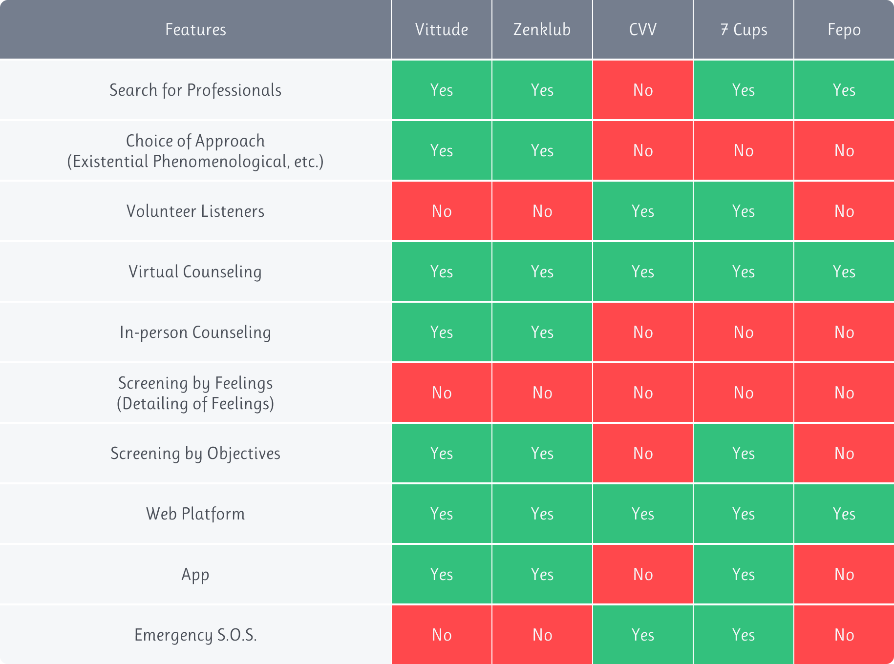
After the analysis, we reached the following conclusions:
- Emergency care and volunteer listener program can be an unfair advantage as they don’t exist in Brazilian psychology platforms (7cups is foreign and CVV is not a complete platform, just a phone number to call in emergency situations);
- There is still space to develop an initial screening that understands the patient better according to their report, not as a self-diagnosis (which is done in most of them) — our solution starts to do it with the screening by feelings and the artificial intelligence of a match, whose algorithm learns as it does more matches;
- We can work with B2B plans to reach this market;
- We take advantage of the 7cups idea to create personal growth paths focused on complementing the psychological treatment with individual steps.
Solution prototype
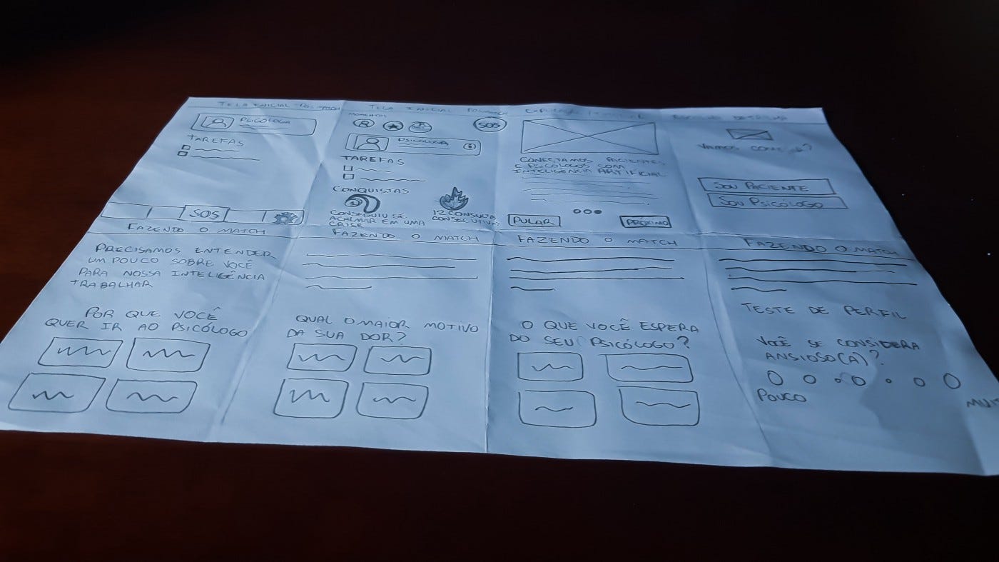
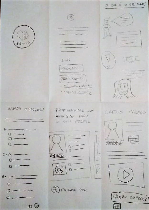
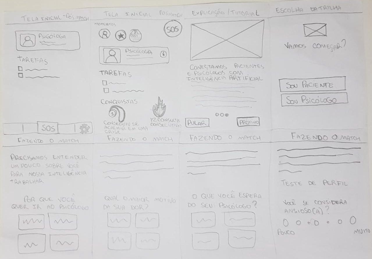
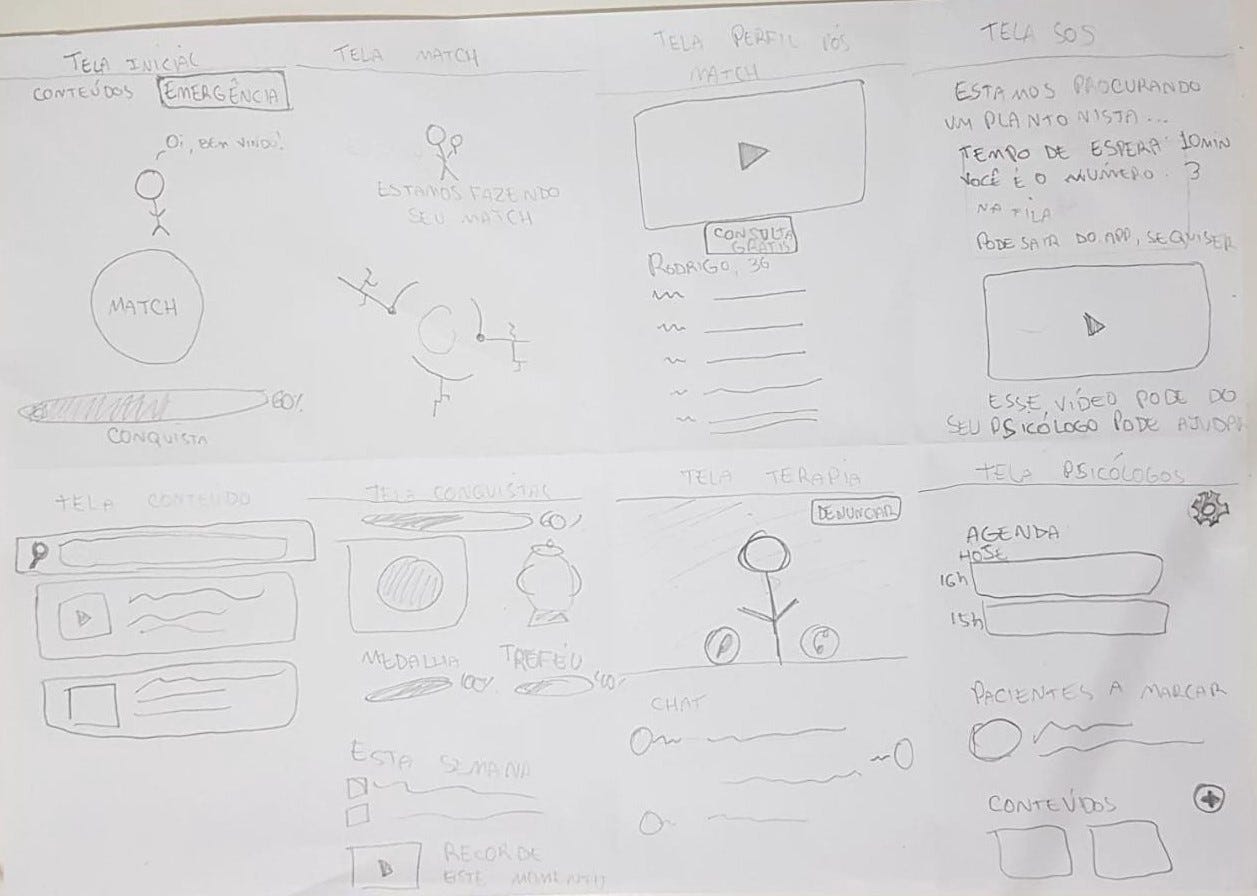
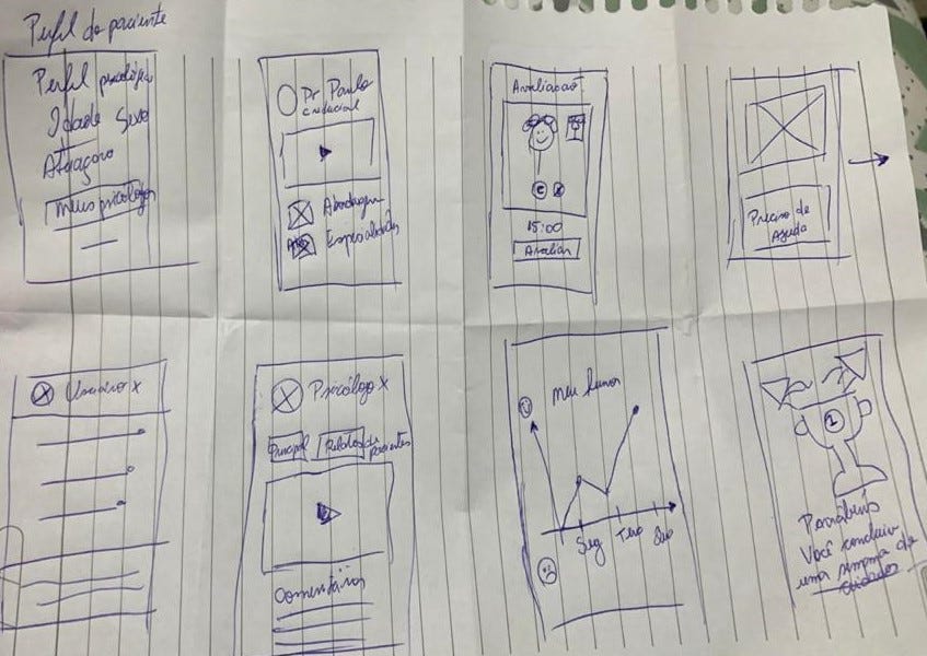
Before we began to do sketches on paper as in the above picture, we had discussed what technology we would use for the solution, given that “to strengthen Brazilians’ mental health” we mean all of them — therefore, we need to be inclusive. Mobile applications have, in our opinion, a more immersive experience, however, they require a large amount of free memory that simple and old smartphones don’t have.
So we decided on the best of both worlds: PWA (Progressive Web App), which gives both the immersive experience and no need to download it and it’s accessible from a computer too. It will also help us with the development, needing less effort, because we would need fewer developers for the different platforms and also simpler code based on HTML, CSS and Javascript with access to native functions.
Crazy Eights
With that said, using the mobile first concept, we designed the app screens using Crazy Eights. It was a moment when a lot of ideas on how to design the same solutions in different ways were brought, always having in mind the personas and the user journeys.
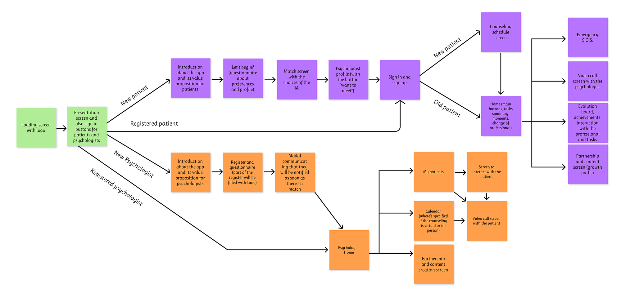
Screen map
To structure our ideas before we dive into the wireframes, we built the app screen map.
Wireframes
We revisited the personas and the journey, our sketches and the screen map to highlight the important points and tie up everything into an experience that creates value for the user, solving their problem with a good usability.
In other words, we designed the wireframes using Figma, defining the information architecture and the positioning of the elements in a low-fidelity prototype:
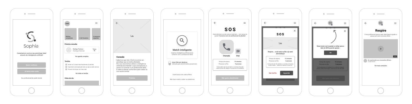
Browse in the complete wireframes.
Usability tests
The low-fidelity prototype was tested with 5 users on the following tasks:
- Search for a psychologist
- Begin a session of virtual therapy
- Start an emergency attendance
Tests report
Alert: high-fidelity prototype spoilers!
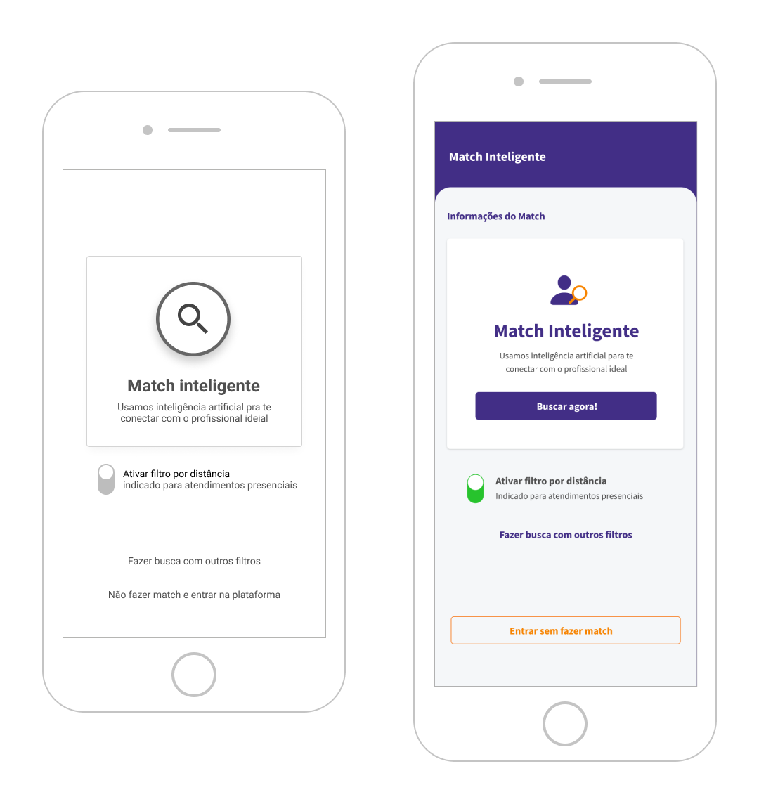
1. Make the match before signing up. The reason is to have one less barrier in order for the user to perceive the value that the platform delivers and decrease the bounce rate. With that, the next step after the onboarding becomes the match, not the signing up.
2. Match button not found. 100% of the users didn’t identify the magnifying glass icon and its card as an action button, so we had to redesign it.
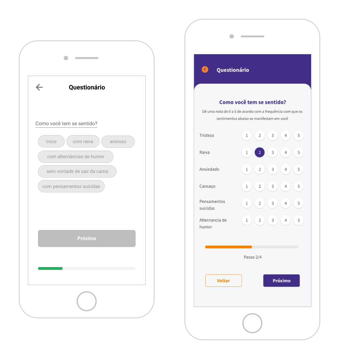
3. Difficulties in answering the questionnaire. It happened mainly because feelings, emotions and physical symptoms generally have different intensities, therefore we put them in a numerical scale.
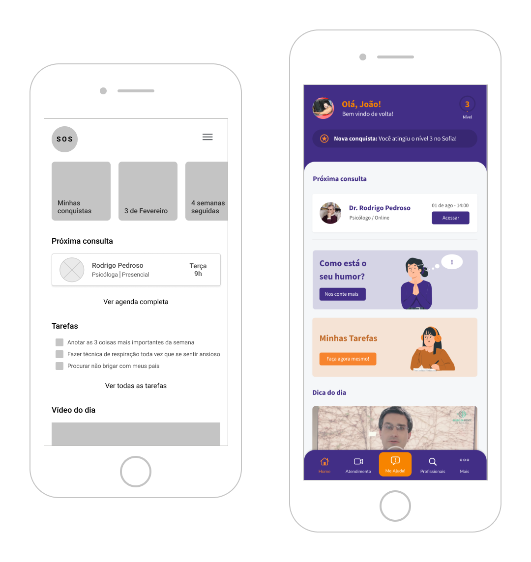
4. Virtual attendance not found. Users struggled to find the access to their virtual counseling, so we created an access button in the card of scheduled therapy and also a menu of attendances.
Writing test
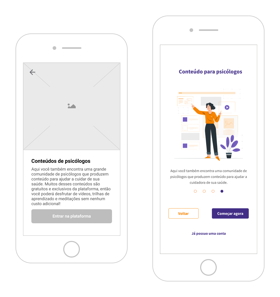
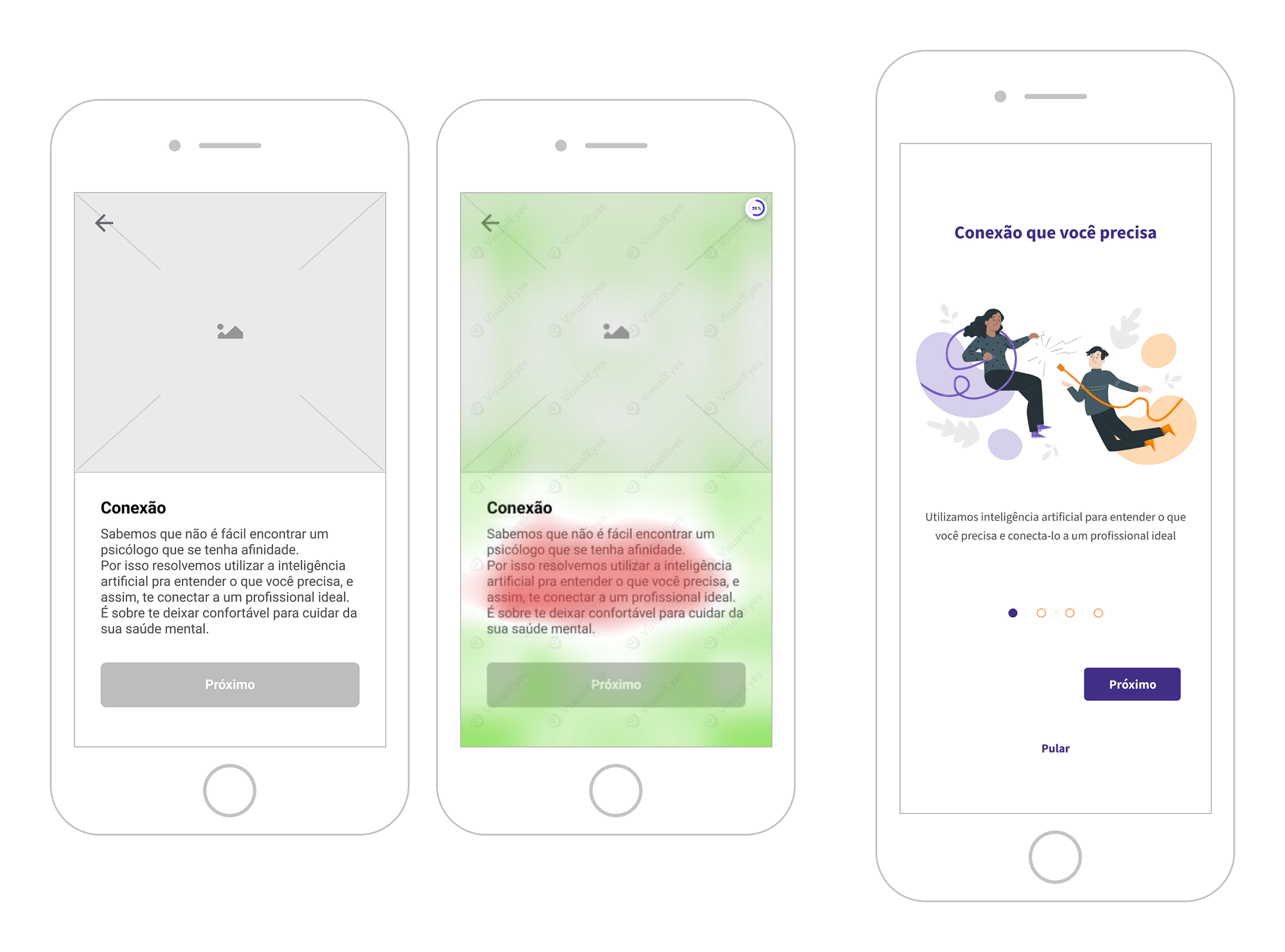
In the usability tests, we also noted that users skipped the whole onboarding screens without reading it. Therefore, using the tool VisualEyes, we analyzed the readability and user attention in these screens. As a result, we rewrote and shortened the texts and added a skip button, creating an easier to read and to understand experience and also less tiring for hurried users.
Branding
Naming
The naming process was based on two aspects:
- Mental health (segment)
- Affinity between the psychologist and the patient (value proposition)
From them, an unfolding was made in a brainstorm, when more creative options arose.
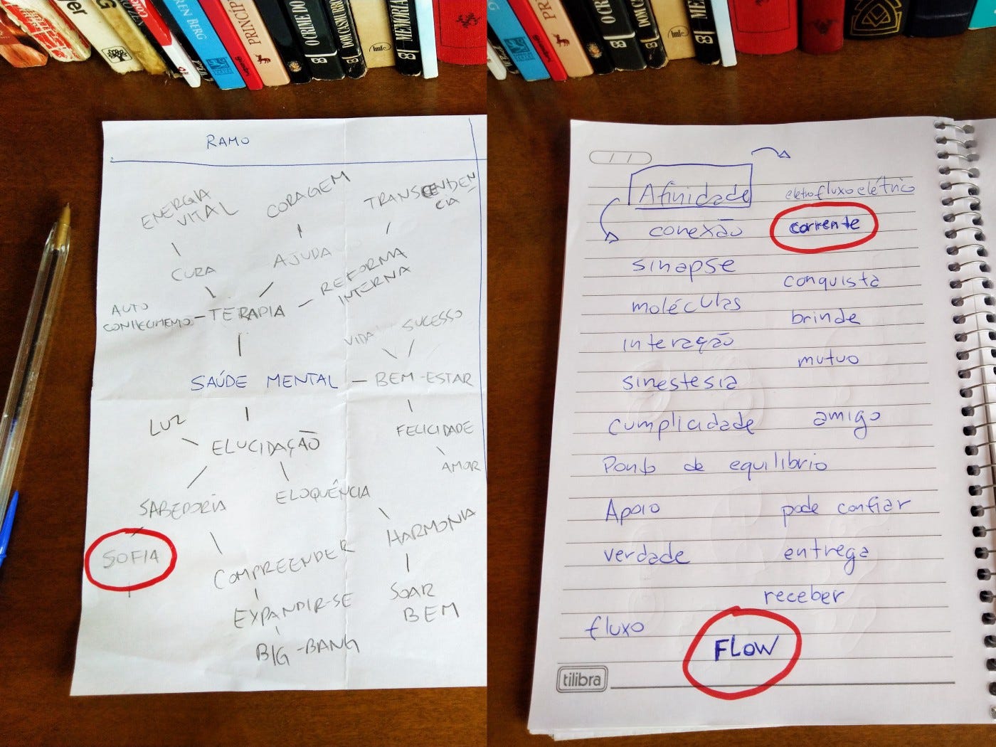
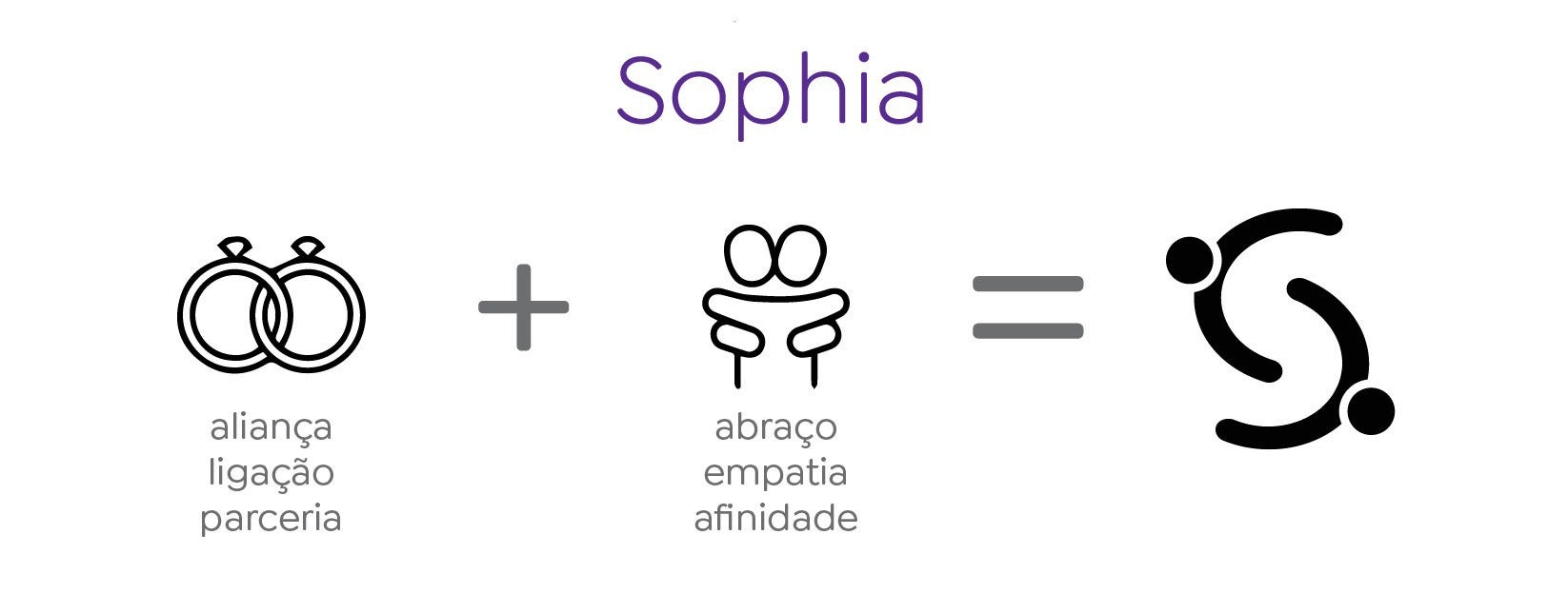
Sophia.
From Greek sophía, it means wisdom and conveys the idea of self knowledge.
We believe that “Sophia” conveys more empathy, openness and humanity to the user by having a personified name.
Sophia will guide you in the search of the best professional to surpass your conflicts and crises, helping to strengthen your mental health and provide self knowledge, besides being always present ‘for the better and for the worse.’
Logo
Colors
Orange mixes active and invigorating emotions, which seek to arouse feelings of vitality and happiness.
Associations: energy, enthusiasm, prosperity, cordiality, change.
Purple conveys tranquility and helps creativity, showing sophistication.
Associations: spirituality, authenticity, veracity, quality, introspection.
Styleguide
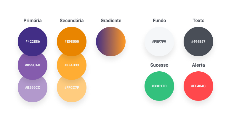
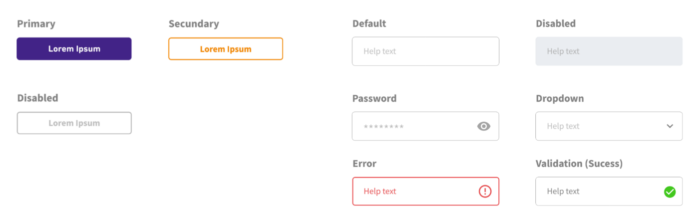
Colors: with them practically defined, we chose some variations of the brand colors so we could apply them in the prototype and also some complementary others.
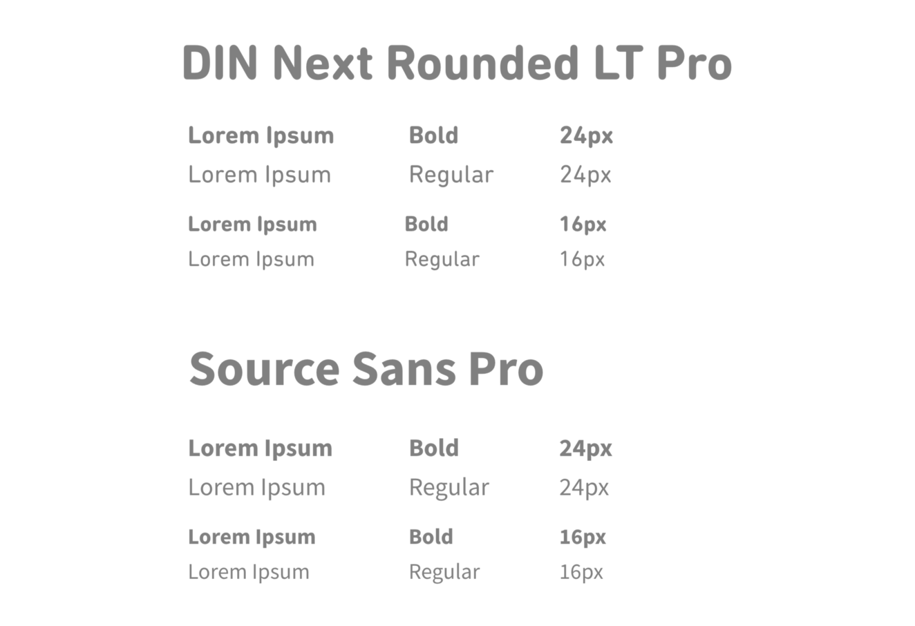
Typography: we opted for two different fonts for titles and text, both sans serif, bringing with them a sensation of modernity — the main reason we chose DIN Next Rounded LT Pro, which strengthens the message with rounded shapes. As a complement, Source Sans Pro, for the text, has excellent legibility, besides being a widely used font on the web, which speeds up page loading.
Buttons and forms: we chose slightly rounded shapes, but not so much, as in halfway between lightness and seriousness.
High-fidelity prototype
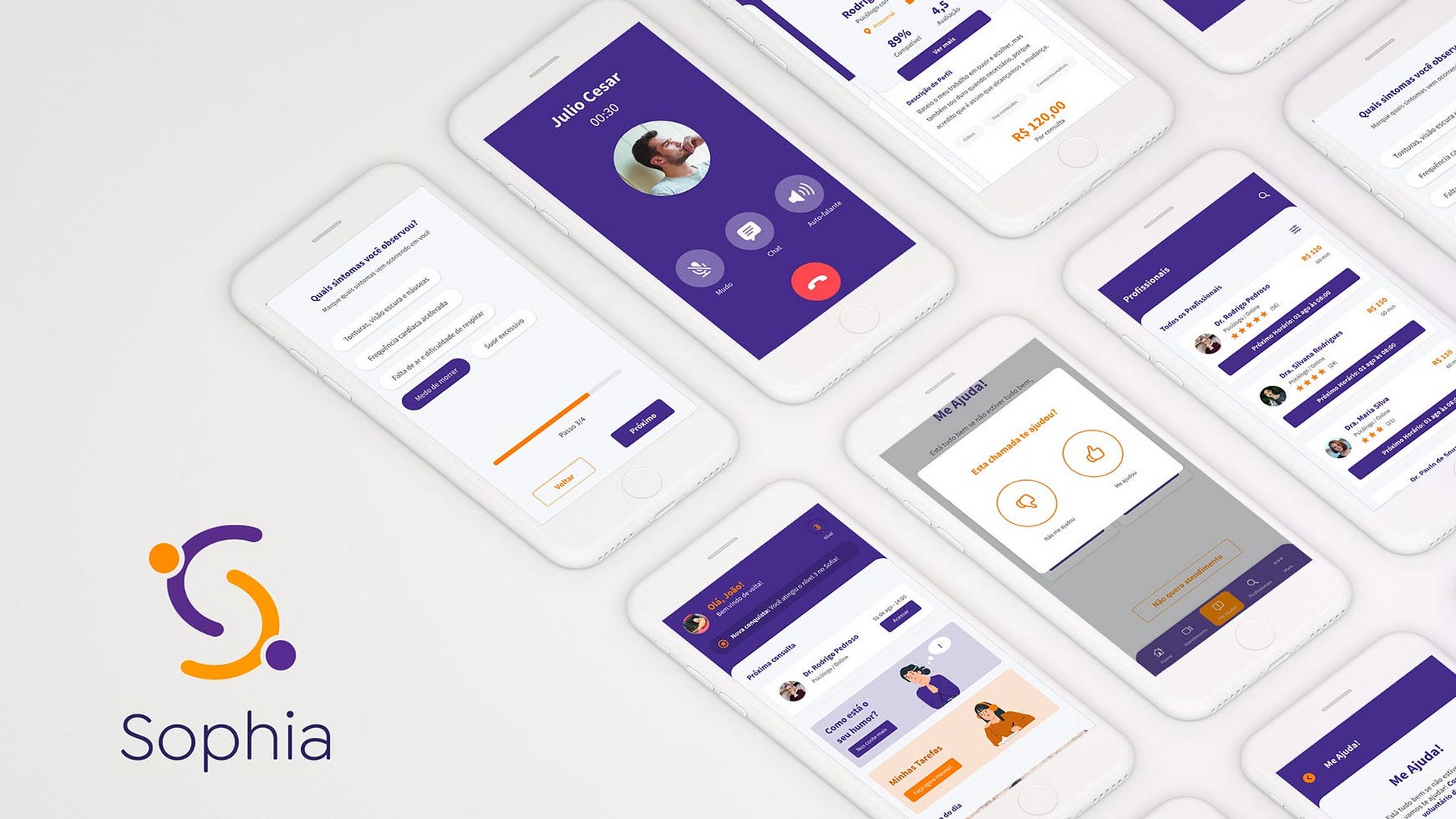
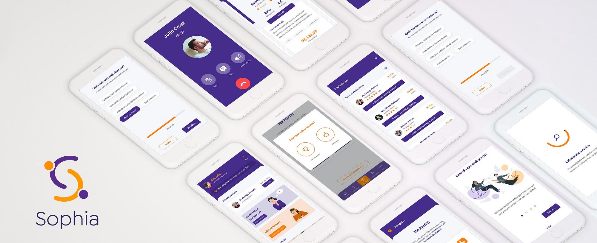
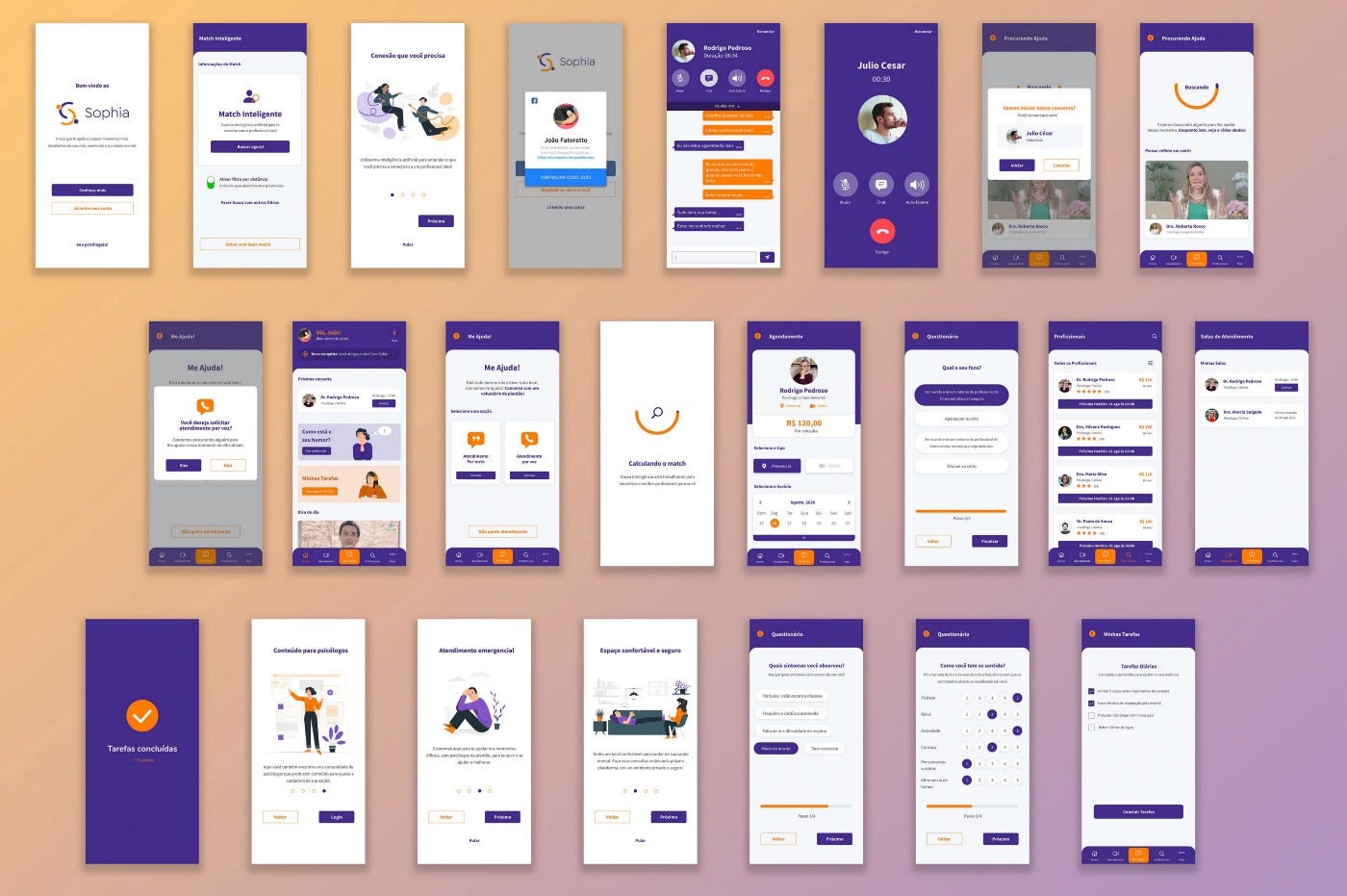
Finally, we built the high-fidelity prototype using Adobe XD, based on the wireframes, usability tests and styleguides.
Check out the full navigable prototype.
Next steps
As a consequence of the prioritization, we raised some important points to be developed after the launching of the MVP (Minimum Viable Product). They are:
- AI (Artificial Intelligence) that talks and counsels patients
- In-person clinics in big metropolises for psychologists to use and offer in-person counseling (eliminating the need and most of the costs with a physical space for them)
Besides that, the project still has space for improvement, as we know that the development of a product never ends.
Users change over time, and so must the product.
Final considerations
We are grateful to our mentors Leandro Rezende and Rafael Frota, of UX Unicórnio, for all the learnings that we had through the process.